Case Study
The 706 Social
The 706 Social is the newest of two local mercantiles owned and operated by long-time client Carla Bounds, in Columbus, Georgia.
Brand Identity
The 706 Social is the second local mercantile opened by Carla in Columbus, Georgia, following the success of Bluebelle Local Mercantile. While the two locations share a common vision and audience, each has its own character. This project focused on creating a distinct identity for The 706 Social while preserving the brand recognition and trust established through Bluebelle.
We began by carrying over key brand elements such as the familiar color palette and typography that have become part of Bluebelle’s visual identity. From there, we developed a new logo shape and supporting visuals that reflect The 706 Social’s unique energy and its community-centered approach.
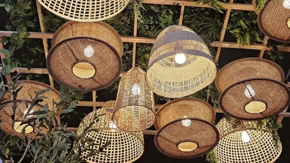
Bluebelle has built a strong reputation through vendor events, workshops, and its consistent support for local makers. It was important for The 706 Social to feel like a natural extension of that story. The final identity feels fresh, rooted in the local community, and instantly credible. It is designed to grow in tandem with the people it serves.
Color Palette
The balance of familiarity and individuality was achieved through a thoughtful combination of color, typography, and illustration. The primary color palette features a muted navy blue paired with rich gold tones. Navy conveys reliability, stability, and tradition, which are essential traits for a brand rooted in community. Gold introduces warmth and a sense of quality, reflecting care and craftsmanship. Together, these colors create a palette that feels grounded, refined, and welcoming.
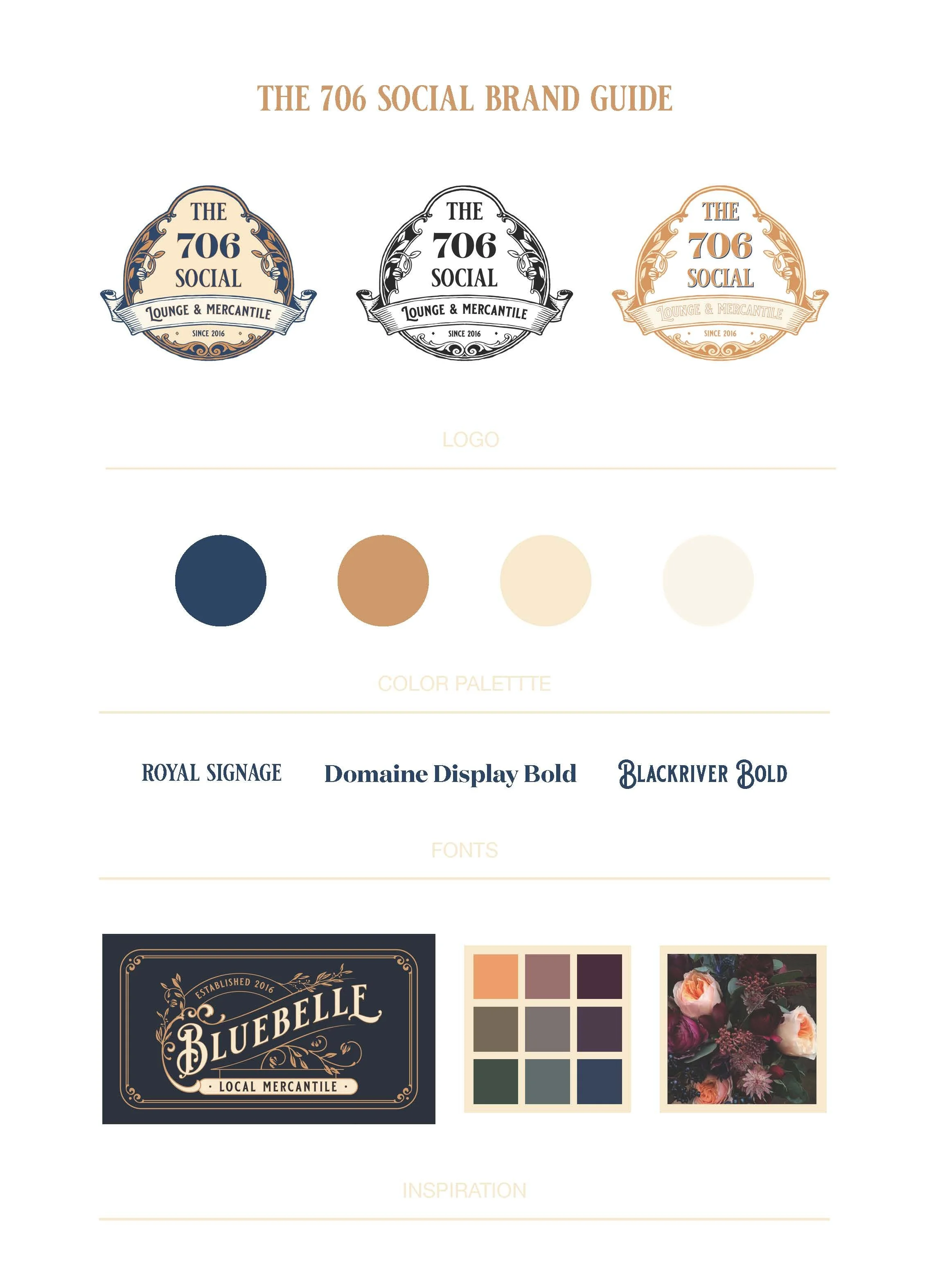
Logo & Typography
The balance of familiarity and individuality was achieved through a thoughtful combination of color, typography, and illustration. The primary color palette features a muted navy blue paired with rich gold tones. Navy conveys reliability, stability, and tradition, which are essential traits for a brand rooted in community. Gold introduces warmth and a sense of quality, reflecting care and craftsmanship. Together, these colors create a palette that feels grounded, refined, and welcoming.
Typography used: Royal Signage, Blackriver Bold, and Domaine Display Bold. These typefaces bring a sense of character and timelessness, giving the brand a handcrafted and well-established feel. Scrolling botanical illustrations were added to soften the boldness of the type, balancing the design to appeal to both masculine and feminine audiences. These floral elements echo the design language of Bluebelle’s logo by creating a visual link between the two brands. They also help communicate the organic, inviting nature of the space and the products it offers.
The logo works well in both full-color and single-color applications, making it adaptable across signage, packaging, print, and digital platforms without sacrificing visual impact. The round logo format was developed for maximum versatility.
This identity reflects the values at the heart of The 706 Social: local connection, thoughtful design, and a strong sense of community. Through intentional design choices and subtle nods to its sister store, this brand system tells a cohesive story while allowing The 706 Social to stand confidently on its own.